The rising trend of responsive web design is likely to bring up a drastic change on how we develop websites in the near future. Very soon, people will head towards the responsive websites and won’t accept the solutions that just ignore mobile users. Therefore, mobile sites as well as dedicated web apps are still fair options for large projects. You should keep an analysis on the work of other designers that can be a great inspiration for your projects. I have listed below some really amazing examples of responsive websites.
Responsive websites are a great way to enhance user experience by adapting the page layout to the device they are using, while accessing the website (this article goes into more detail). Usage of media queries are one of the best and standard strategies for creating responsive web designs. Since, the digital age is here to stay. So, we must adapt to compete. With the rapid growth of mobile devices, like Androids and tablets, the job of web developers is getting more complex. In this competitive internet era, you should remain abreast with the latest trends and technologies.
There is nothing new in responsive technology, previously tablet based designers had to choose out of fluid or static route. Currently, responsive web designs take a comparable approach by implementing fluid widths in percentages. They take a step ahead by using adjustable layouts and scalable images, while browsing the site.
Check Out the List of Wonderful Responsive Websites
No-Refresh
The natural breakthrough for the responsive design is to make it accessible to as many people as possible. Therefore, it is essential to learn the pros and cons of responsive site. No-refresh understands this and has designed a fully responsive website, which is a pleasure to browse on different devices.
HTML Panda
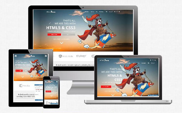
HTMLPanda is one of the best responsive web designs that will definitely inspire you with its elegant designing and consistency across various screen sizes. They have better utilized the Call-To-Action procedure with strong Call-To-Actions for viewing portfolio or to contact them or in order to learn more.
The Cacao Trail
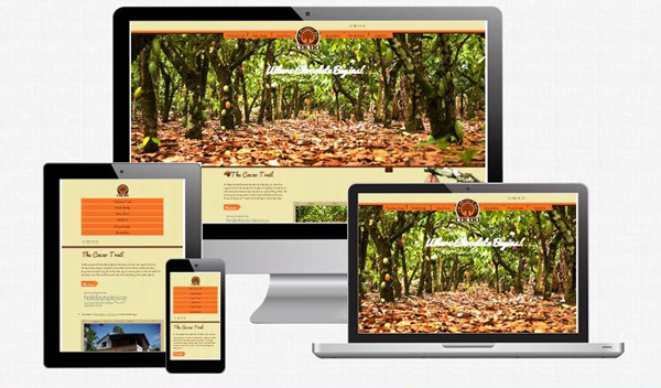
Navigating the official site of “The Cacao Trail” on your mobile phones is a complete joy, you will really like the enlarged links on your small-screened mobile phones where touching small words often annoys you. With a faster loading speed and compatibility with all the devices, it still manages to maintain its elegance.
PSD to WordPress Expert
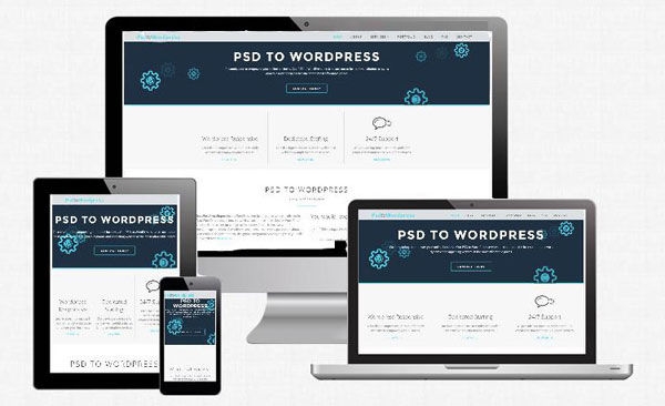
The most admirable about PSD to WordPress Expert is that the site adapts itself flawlessly in accordance with its surroundings, no matter what the screen size is. Branding, essence as well as structure are respectfully maintained. It offers flexible user experience and is a joy to browse on various devices.
Weight Shift
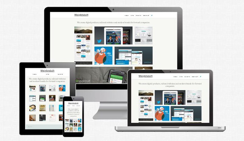
Digital design studio, Weight Sift has come up with lighter and super responsive website that fits perfectly to every screen-size. The adaptive layout and fully responsive features make this site a pleasure to navigate.
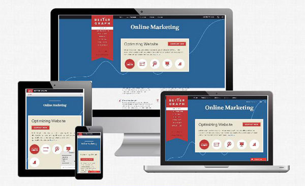
Better Graph
As a perpetuation of the trend from the simple websites to the responsive designs, Better Graph deals with its structural complexity with elegance and grace. Typography remains consistently beautiful on different devices. It may not be noticed by most of the users, but the responsive geeks will surely appreciate the sleek motion as the web page layout adapts for reducing the page width.
CSS Chopper
With wonderful visual effects, this new cross-platform layout is quite appealing. Also, the large typography gracefully degrades on smaller screens. The official site of CSSChopper looks great on large desktop screens and extremely well on mobile devices.
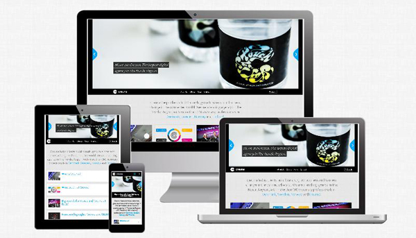
Creuna
When viewed on mobile phone, this website really has some cool design touches that makes the navigation enjoyable. You will love the ways of contact navigation pops out on every page and the continuous logo transitions to distinct designs every five seconds. The expansion and contraction of links on touching, looks beautiful and does not require page refresh as well as displays lots of additional content.
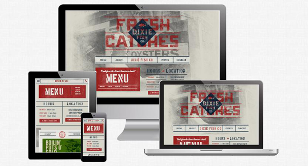
Dixie Fish
This ultra-responsive website is a joy to navigate with the super cool web design that looks consistent on every device without losing its elegance. This is the best example of modern website with awesome creativity.
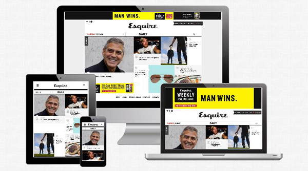
Esquire
Esquire is a magazine website with fantastic design, which looks truly neat and clear on the mobile device as well. Changing visual effects with the mouse hovering over the images and links are the heart winning. This exciting magazine site provides you the latest news, advice and various tips & tricks.
Conclusion
Thus, you can check out all these incredible web designs and can set up new ideas to create responsive website for your own projects. But, if you are not sure whether responsive web design is the right choice for your site or not, then it is important to know that who your customers are and how they interact with your site. This will give you a clear idea about which design to choose.


Responses to “Incredibly Amazing Examples of the Best Responsive Websites”
Jennifer that’s indeed a cool list and ofcourse style matter nowadays and always.Building Website with good design and high response is bit a difficult thing, but everything is possible 🙂 Keep Writing 🙂
Hi Krishna brother, I am here on behalf of Jennifer.
Thanks for your precious comments. I hope you will simply simplify the all web designing task with the help of this post. Keep visiting mate for more fruitful updates.
We truly appreciate the fine attention that you are giving our site!
Many thanks from Creuna.
Thank you so much for your appreciation, I hope our post would be surly inspirational for you.
All the sites are so attractive. But I love Better Graph. I love its functionality and other things.
Thanks Gagan for your precious comment. I hope you like our collection of best and responsive themes.